Branding Lexington lawyers
Branding the office
 Lexington approached me because they wanted to do something ‘arty’ with the central wall in their office. During the first meeting is soon became obvious that their website and company logo; their branding needed some updating too.
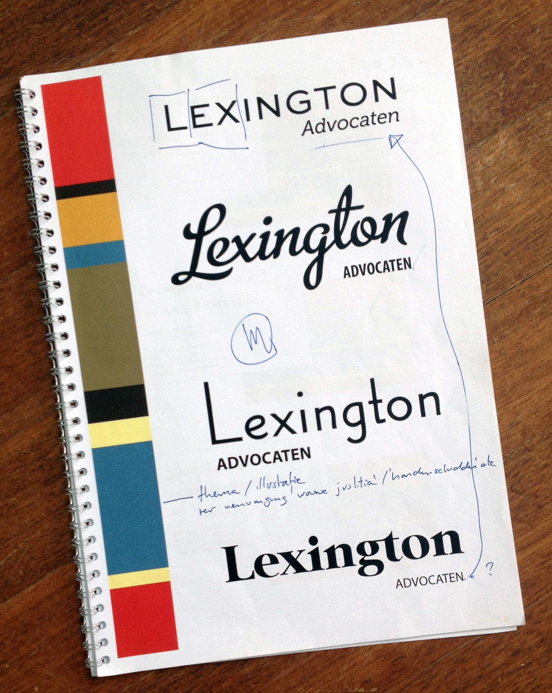
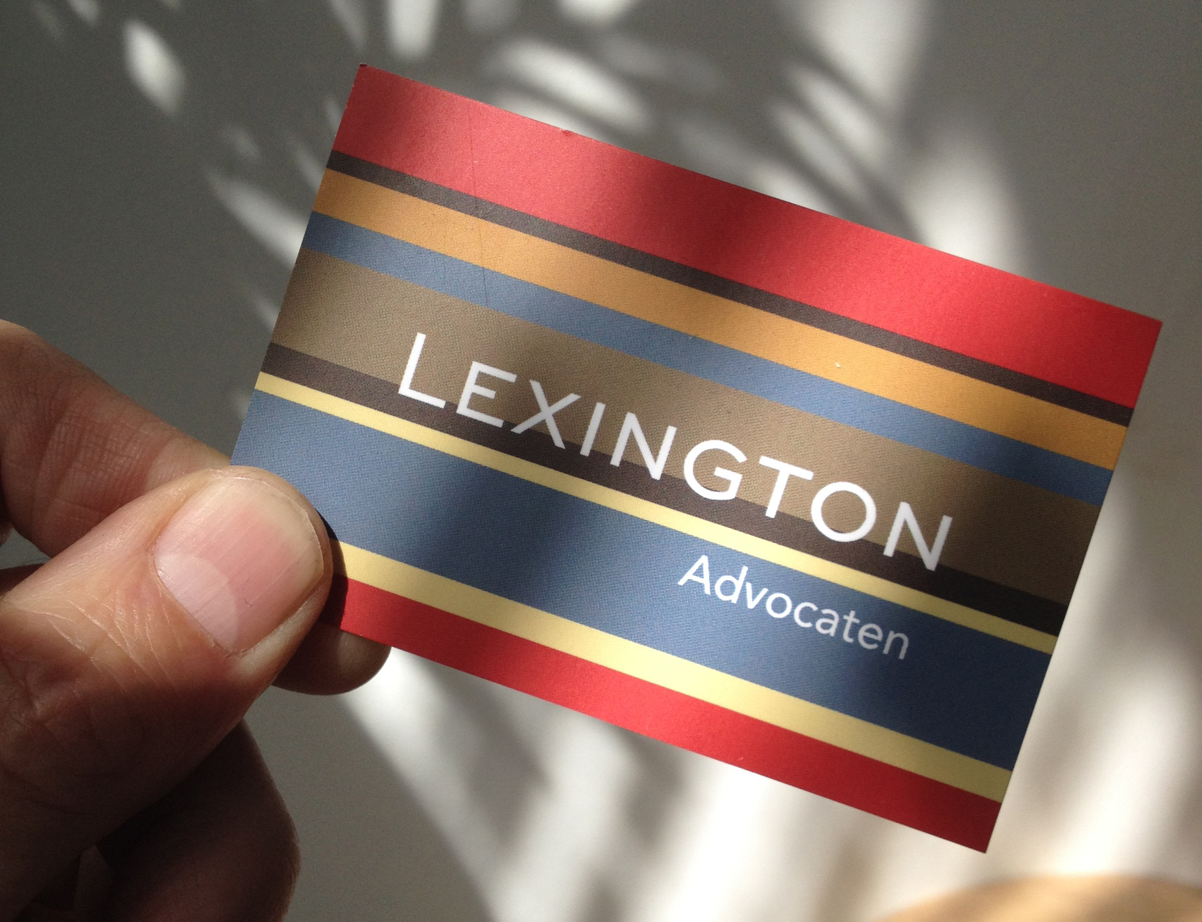
I made a combined proposal; simple and stylish lettering that, together with a striped band, form the new company logo. My intention was to avoid using generic lawyer type classics. (think Justitia, serif letters and scales)
This was the first proposal
This is the most interesting moment when making (or re-doing) a company logo. This is the moment before you go into detail. You can talk with the client on an abstract level about the meaning (the sense and nonsense ) of letterforms, shapes and colors in combination with their company.
Obviously the more work you put into it beforehand, the better you can steer these conversations. In this case I wanted to keep them away from traditional judicial graphic practice.
Website and color pattern
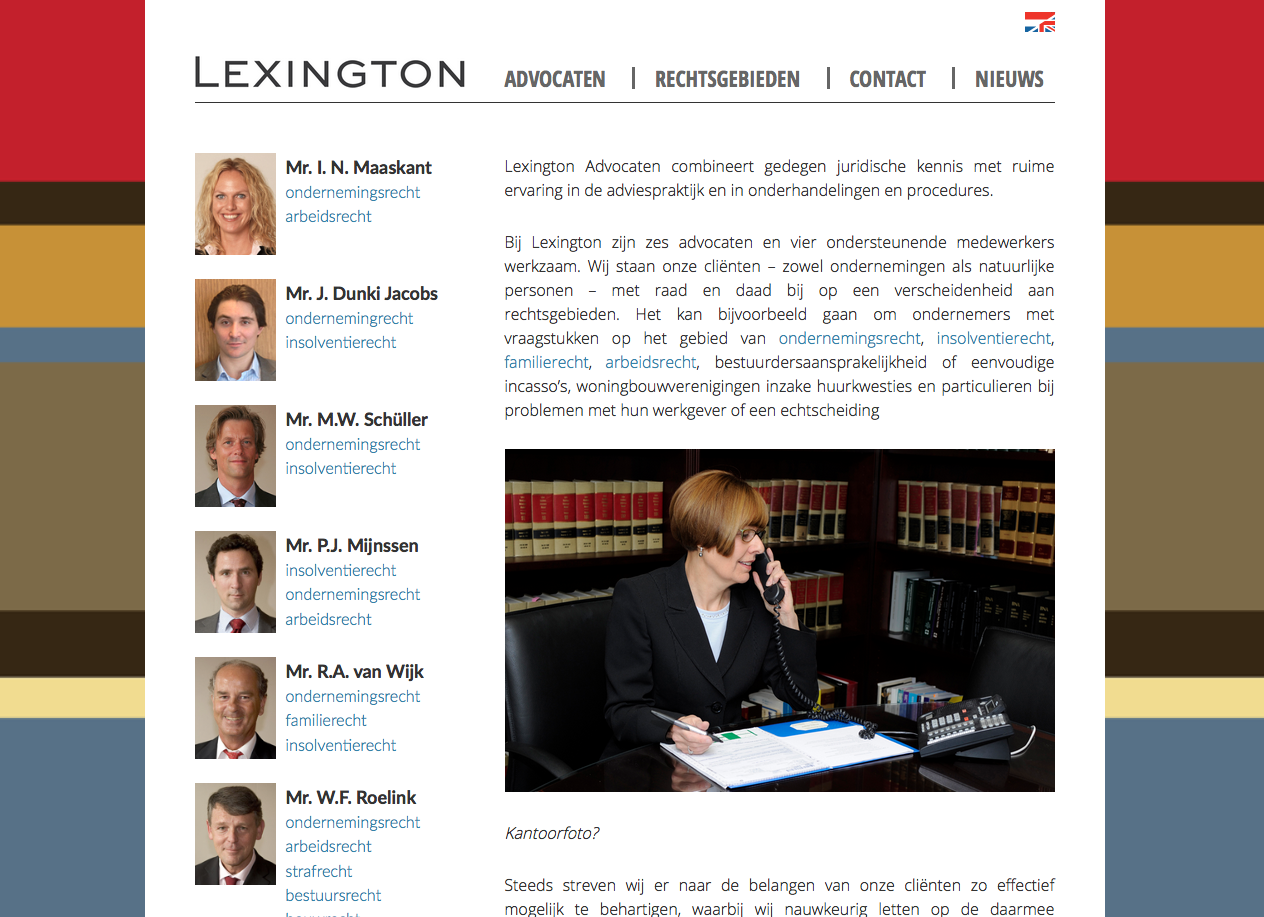
 The pattern is based on rows of lawbooks. (as shown in the website photo)
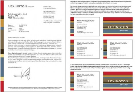
After agreement on the new company logo, I made designs for all printwork and the website.
I changed the domainname from lexadv.nl to lexington-advocaten.nl which is easyer to remember and facilitates an SEOfriendly structure. (offcourse forwarding old links and maintaining Google status is part of such a move)
Technical support
I have an extensive network of technical support when needed (think: webstructure, apps, SEO, printwork, stickers, actual steel signs etc) I worked as a graphic designer and online art director for years. I enjoy making a solid whole out of different parts
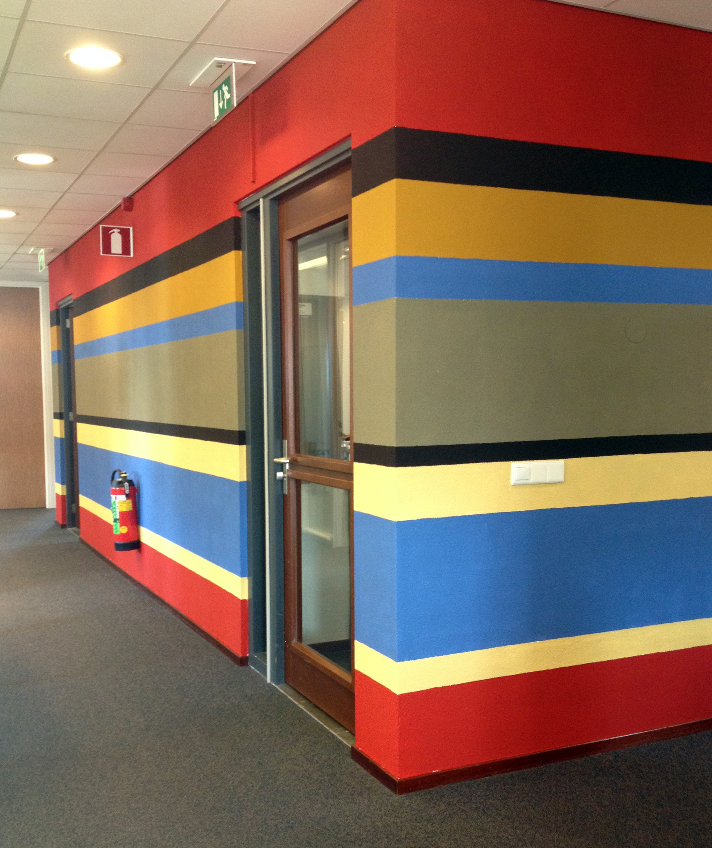
The central wall has become part of the branding
The ‘artsy’ wall that started this assignment, has become a derivative of the company’s new identity. Instead of a standalone piece.